

Velora
A crypto dashboard landing page that shows the product early
A single dark-mode landing page that explains a crypto dashboard fast — product preview in the first fold, scannable feature bento, and one clear path from hero to demo or signup.
Landing page · UI design · Framer development
Visit live site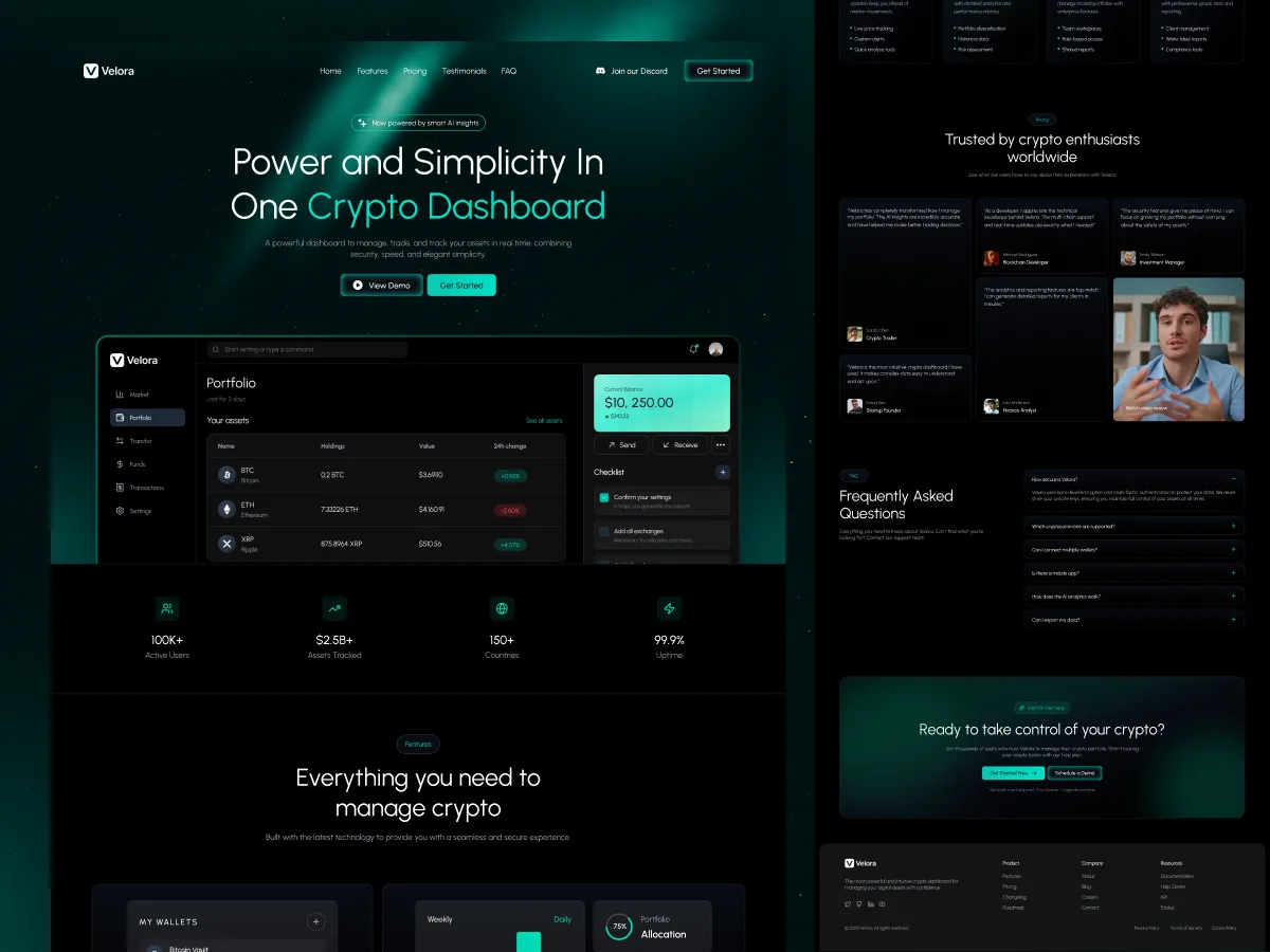
Problem & goal
Velora needed a single landing page that explains a crypto dashboard quickly, without making users dig through long copy. The goal was to show the product UI early, communicate key capabilities, and guide visitors to one clear action — demo or get started.
What we did
We planned the page structure and designed the UI system, focusing on strong hierarchy, clear sections, and consistent CTAs. A dark visual direction with subtle highlights keeps the page readable while still feeling product-led.
The page and flow
The page opens with a hero that states the value clearly, supported by a product preview and primary CTAs. A features bento grid then breaks down what the dashboard helps with in a scannable way, and “How it works” shows the setup steps so new users understand the process fast.
Integrations and use cases help visitors confirm fit, while pricing supports the decision. Testimonials, an FAQ, and a final CTA close the page with proof and clarity, and the footer provides quick navigation across product and resources.
The result
The landing page tells a clear product story from first fold to final CTA, with a simple path to demo or signup at every step.
Outcome
outcome metric — being verified with the client
From the client
client quote — pending written permission
Want a website like this?
Read more about website & landing page design & development at the studio, or skip straight to the call.
 Book a callCurrently available —15 min