

Bluestream
A multi-page Framer site that explains a complex platform calmly
Design and Framer development across Home, About, Technology, Sustainability, and Newsroom — turning dense platform content into a calm, editorial experience for investors, partners, and operators.
Website · UI design · Framer development · CMS
Visit live site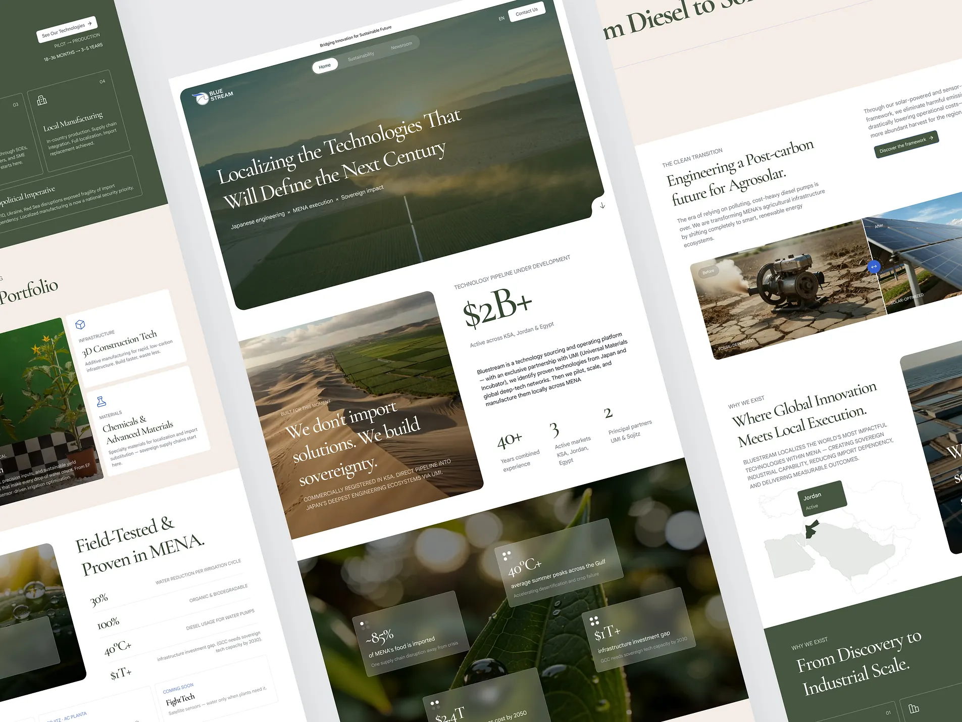
Problem & goal
Bluestream needed a website that could explain a complex platform without making it feel heavy. The brand works across technology localization, pilot programs, commercial deployment, and regional capability building — so the site had to speak to investors, partners, operators, and institutional audiences at once.
The goal was to present Bluestream as a serious technology platform, not a basic corporate site. The experience needed to explain what the platform does, why the MENA region matters, which technologies are ready, and how Bluestream helps move ideas from pilot to regional scale.
What we did
We designed and developed the main site structure in Framer across Home, About, Technology, Sustainability, and Newsroom pages. The work focused on turning dense platform content into a calm, readable, and premium web experience.
The site uses large editorial headlines, soft green tones, warm backgrounds, agricultural imagery, structured cards, and clear page sections. We also built CMS-based technology cards, a contact overlay, a leadership carousel, an interactive MENA map, process cards, a sustainability comparison module, and responsive layouts for desktop, tablet, and mobile.
The site and flow
The homepage introduces Bluestream's core story, from technology localization to regional urgency and field proof. The About page explains the platform model, leadership, partners, and regional focus. The Technology page uses a CMS portfolio to present deployable technologies with categories, metrics, and short summaries.
The Sustainability page explains the clean transition, carbon-aligned systems, and commodity verification through visual modules and comparison sections. The Newsroom adds an editorial layer — a place for updates, platform thinking, and market insight.
The result
The project shows how a complex institutional platform can be made easier to understand through structure, writing hierarchy, and Framer execution. Instead of pushing everything into one page, the site gives each audience a clear path — from overview to proof to contact.
Outcome
outcome metric — being verified with the client
From the client
client quote — pending written permission
Want a website like this?
Read more about website & landing page design & development at the studio, or skip straight to the call.
 Book a callCurrently available —15 min