



Health Hub, Healthcare SaaS Landing Page
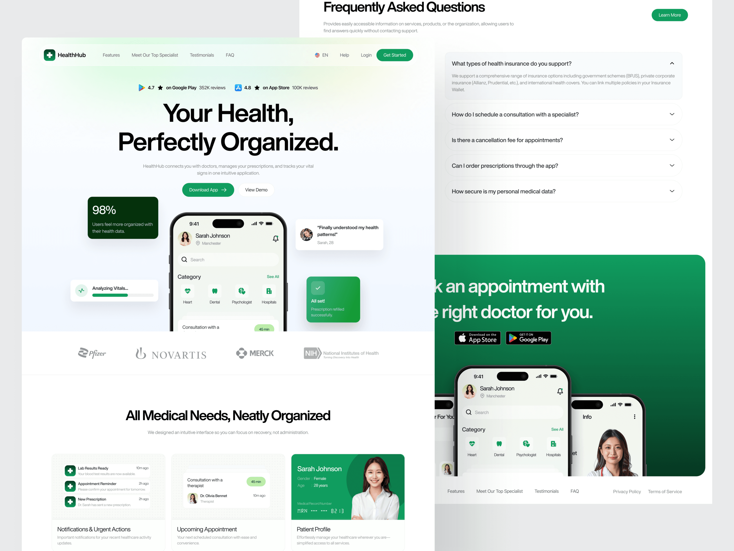
Health Hub, Healthcare SaaS Landing Page
Project Overview
Health Hub is a modern, conversion-focused SaaS landing page designed for a digital healthcare companion that helps patients organize every aspect of their healthcare journey in one place. The platform introduces the product through a clean, patient-friendly interface that emphasizes clarity, trust, accessibility, and ease of use. Rather than overwhelming users with complex medical information, the experience presents appointments, prescriptions, medical records, insurance details, and health insights in an intuitive and visually digestible format.
- Role: UI/UX Designer, Visual Designer
- Deliverables: End-to-end responsive desktop and mobile landing page, healthcare dashboard interface, component-based design system
- Visual Strategy: Clean healthcare aesthetic, calming green color palette, spacious layouts, trust-focused visuals, and conversion-driven user experience
Design System & Visual Strategy
Color Palette
Primary Green: The core brand color representing health, growth, safety, and trust. Used across primary actions, highlights, and key interface elements to reinforce a reassuring healthcare experience.
White & Soft Gray: Provide generous whitespace and create a clean, distraction-free interface that improves readability and reduces cognitive load.
Light Green & Neutral Backgrounds: Applied to dashboard cards, information panels, and supporting sections to maintain visual balance while reinforcing a calm and professional atmosphere.
Typography
- Headings: Large, bold typography with generous spacing establishes a strong visual hierarchy while making important healthcare information immediately noticeable.
- Body & UI Text: Clean, highly readable sans-serif typography ensures effortless scanning across dashboard cards, FAQs, specialist profiles, and informational content.
High-Impact Section BreakdownsThe Healthcare Hero Experience
A welcoming hero section immediately introduces the platform through the message “Your Health, Perfectly Organized.” A live application preview, floating health cards, app store ratings, trust indicators, and download call-to-actions quickly communicate the product’s value while encouraging immediate engagement.
Trusted Healthcare Partners
A dedicated brand credibility section showcases recognizable healthcare organizations and trusted partners, reinforcing confidence and strengthening the platform’s professional identity from the very beginning of the user journey.
Smart Medical Dashboard Showcase
The centerpiece of the landing page presents an organized dashboard featuring lab results, appointments, prescriptions, insurance information, patient profiles, medication tracking, and health status cards. A modern bento-style layout visually demonstrates how complex healthcare data can be simplified into an intuitive user experience.
Simple Three-Step Patient Journey
The onboarding experience explains the platform through a streamlined three-step process—creating an account, connecting medical information, and managing healthcare from a single dashboard. This minimizes perceived complexity while encouraging adoption.
Featured Healthcare Specialists
Professional doctor profile cards introduce medical specialists using friendly photography, ratings, availability indicators, consultation options, and specialties. Human-centered design strengthens trust before users even download the application.
Patient Success Stories
Authentic testimonial cards provide social proof by highlighting improved appointment management, medication tracking, healthcare organization, and overall patient satisfaction. These real-world experiences reinforce the platform’s credibility and reliability.
Frequently Asked Questions
An accordion-based FAQ section addresses common concerns regarding insurance compatibility, appointment scheduling, prescription management, cancellation policies, and medical data security. The structured layout keeps the interface clean while making information easily accessible.
Download the Health Hub App
The landing page concludes with a conversion-focused call-to-action featuring mobile application previews, App Store and Google Play badges, and compelling messaging that encourages visitors to begin managing their healthcare digitally.
Key Performance & UX Objectives Met
Frictionless User Journey: The landing page follows a logical storytelling structure that introduces the platform, demonstrates its capabilities, builds trust, addresses user concerns, and concludes with a strong download-focused call-to-action.
Healthcare Information Simplification: Complex medical records, appointments, prescriptions, insurance information, and health insights are presented through modular dashboard cards and clear visual hierarchy, reducing cognitive load.
Trust-Centered Experience: Soft healthcare colors, professional specialist profiles, trusted partner logos, testimonials, and clean layouts work together to establish credibility throughout the experience.
Accessible Information Architecture: Logical content progression, generous spacing, readable typography, and consistent component patterns ensure users of all ages can quickly understand and navigate the interface.
Conversion-Focused Design: Download prompts, trust indicators, dashboard previews, and social proof collectively encourage users to install the Health Hub application while reinforcing its value proposition.
" As we continued to use their tool and found more use cases, our feature requests quickly found their way into their backlog. "
Cristian M. Durant

"Their team understood our goals immediately, and every iteration brought us closer to a refined, meaningful experience."
Cristian M. Durant

"From the initial concept to final delivery, the process was fluid and collaborative — we always felt heard."
Cristian M. Durant