



Velora, Crypto Dashboard Landing Page
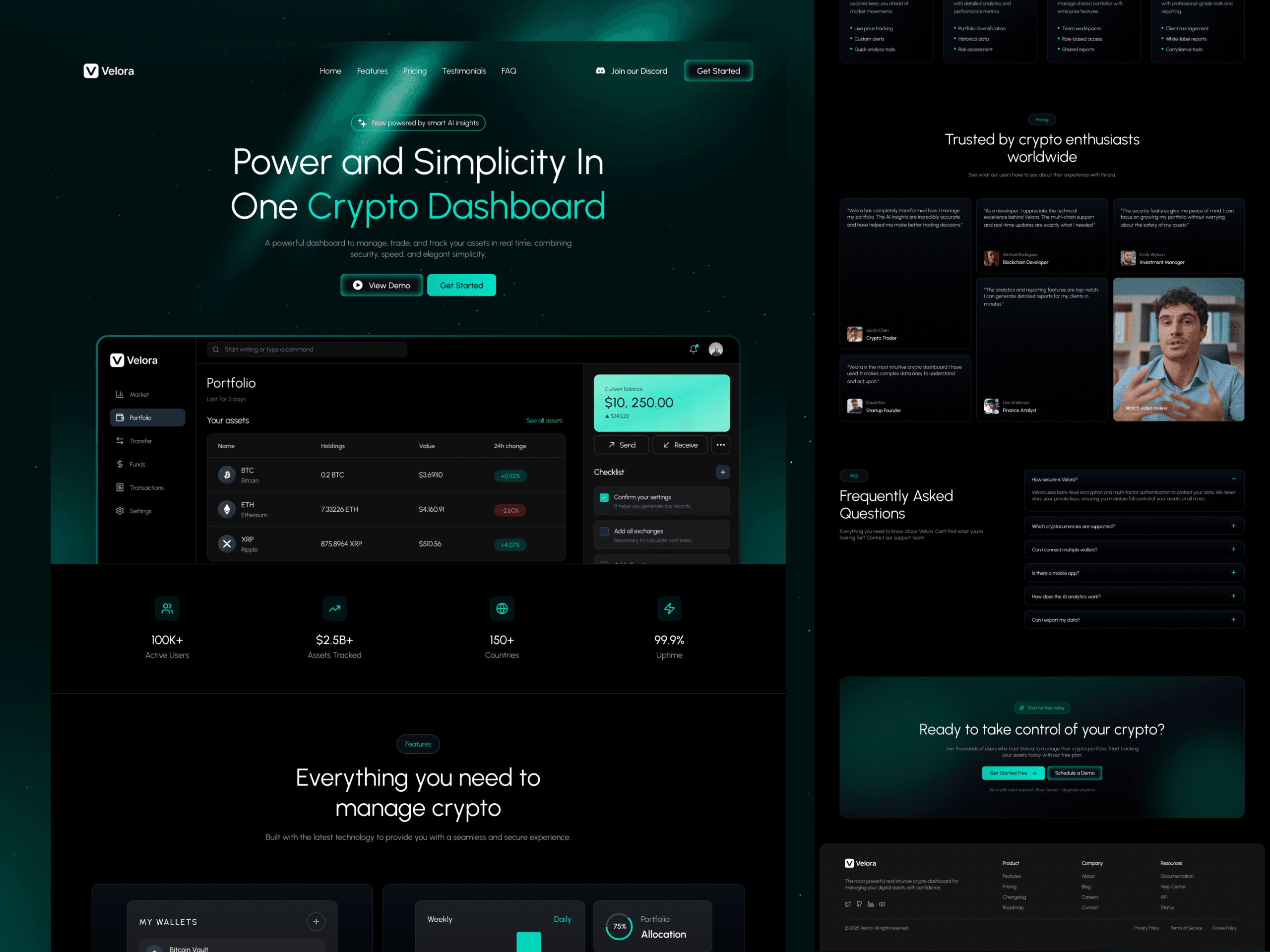
Velora, Crypto Dashboard Landing Page
Project Overview
Velora is a modern SaaS landing page designed for a cryptocurrency dashboard platform that helps users monitor digital assets, analyze market activity, and manage their portfolios through a streamlined interface. The landing page communicates the product’s value quickly by showcasing the dashboard early, presenting core capabilities through concise content, and guiding visitors toward requesting a demo or getting started.
Role: Web & UI Designer, Framer Developer
Deliverables: End-to-end responsive desktop and mobile landing page, product-focused UI design, reusable Framer components, section flow planning
Visual Strategy: Premium dark interface, subtle neon highlights, modern product-focused layouts, and conversion-driven user experience
Design System & Visual Strategy
Color Palette
Deep Charcoal & Midnight Black: Form the foundation of the interface, creating a premium environment that keeps attention focused on the dashboard experience.
Electric Blue & Neon Accents: Used strategically across call-to-action buttons, highlights, charts, and interactive elements to reinforce the technology-driven identity.
Neutral Gray & White: Improve readability across pricing tables, feature descriptions, testimonials, and supporting interface content while maintaining visual balance.
Typography
Headings: Bold, modern typography establishes a strong visual hierarchy and communicates product benefits with immediate clarity.
Body & UI Text: A clean geometric sans-serif typeface provides excellent readability across dashboard previews, feature cards, pricing tables, FAQs, and navigation elements.
High-Impact Section Breakdowns
Product Showcase Hero
The hero section immediately communicates the dashboard’s value proposition through a prominent product preview, concise messaging, and primary call-to-action buttons that encourage visitors to request a demo or get started.
Feature Bento Grid
A structured bento-style feature layout presents the platform’s core capabilities in a highly scannable format, allowing users to quickly understand how the dashboard simplifies cryptocurrency monitoring and portfolio management.
Simple Product Workflow
The “How It Works” section explains the onboarding process through a clear step-by-step journey, helping new users understand how to connect, manage, and monitor their crypto assets with minimal effort.
Integrations & Real-World Use Cases
Dedicated sections highlight supported integrations and practical use cases, enabling potential customers to quickly determine whether the platform fits their workflows and investment needs.
Pricing & Customer Validation
A conversion-focused pricing section is supported by customer testimonials and social proof, helping visitors build confidence before making a purchasing decision while reinforcing the product’s credibility.
Frequently Asked Questions
An organized FAQ section addresses common product concerns through a clean accordion interface, providing quick answers without overwhelming the user experience.
Final Conversion Call-to-Action
The landing page concludes with a strong call-to-action encouraging users to request a demo or create an account, supported by clear messaging and consistent visual hierarchy.
Key Performance & UX Objectives Met
Clear Product Communication: The landing page presents the dashboard immediately, allowing visitors to understand the platform’s value within the first screen without relying on lengthy explanations.
High Visual Scannability: Bento layouts, structured content sections, generous spacing, and strong typography enable users to explore features quickly while maintaining a smooth scrolling experience.
Conversion-Focused Journey: Consistent call-to-action placement, pricing information, testimonials, and FAQs guide visitors naturally toward requesting a demo or signing up.
Consistent Product Experience: Reusable design components, responsive layouts, and a cohesive spacing system create a polished experience across desktop and mobile devices.
Trust & Decision Support: Integrations,
customer testimonials, pricing transparency, and clear onboarding information work together to reduce friction and improve user confidence throughout the purchasing journey.
" As we continued to use their tool and found more use cases, our feature requests quickly found their way into their backlog. "
Cristian M. Durant

"Their team understood our goals immediately, and every iteration brought us closer to a refined, meaningful experience."
Cristian M. Durant

"From the initial concept to final delivery, the process was fluid and collaborative — we always felt heard."
Cristian M. Durant