

 Jul 12, 2026
Web Development
5 min read
Jul 12, 2026
Web Development
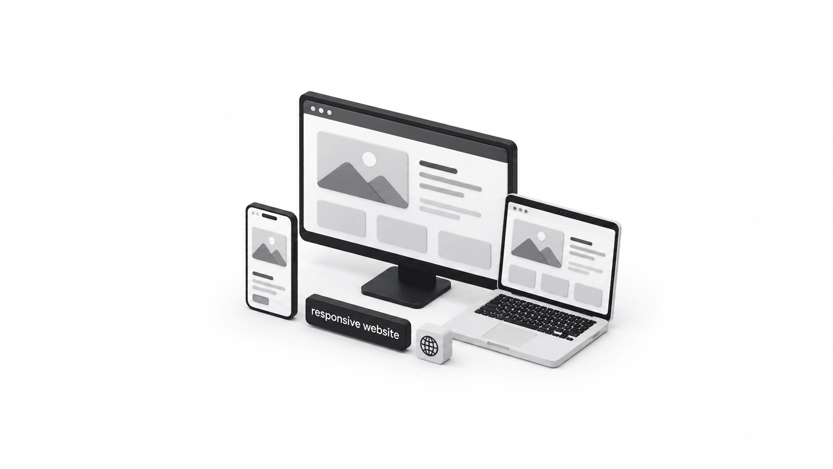
5 min readresponsive websiteIn today’s mobile-first world, a website that looks great on a desktop but falls apart on a phone or tablet simply won’t cut it anymore. Customers browse, compare, and buy from every device imaginable, which is exactly why so many brands are turning to a responsive website development company to build sites that adapt smoothly to any screen size. Whether it’s a small local business or a growing enterprise, having a site that performs flawlessly across devices has become a non-negotiable part of doing business online.
This article walks through what responsive web design really means, why it matters for growth, and how partnering with the right development team can make all the difference for a company’s online presence.
At its core, responsive design means a website automatically adjusts its layout, images, and content based on the device being used to view it. Instead of maintaining separate versions of a site for mobile and desktop, a single, flexible design reshapes itself on the fly. This is exactly the kind of work a responsive website development company specializes in — creating one adaptable, future-proof site instead of multiple disconnected versions.
The goal is simple: no matter if someone is browsing from an iPhone, an Android tablet, or a widescreen monitor, the experience should feel smooth, fast, and easy to navigate.
More people than ever are shopping, researching, and making decisions from their phones. If a site isn’t optimized for mobile, businesses risk losing visitors within seconds of them landing on the page. This is one of the biggest reasons companies actively search for a reliable web development partner who understands how to design for every screen.
Search engines prioritize mobile-friendly websites in their rankings. A poorly optimized site can quietly hurt visibility, even if the content itself is excellent. Working with a team that understands both design and technical SEO helps ensure a site doesn’t just look good — it performs well in search results too.
A frustrating browsing experience — text too small to read, buttons that are hard to tap, images that don’t load properly — sends visitors straight to a competitor’s site. A well-structured, responsive layout keeps people engaged longer, which naturally leads to more inquiries, sign-ups, and sales.
Instead of building and maintaining a separate mobile site, a responsive approach uses one codebase that adapts everywhere. This cuts down on long-term maintenance costs and makes future updates far simpler to manage.
Not all web development providers offer the same level of expertise. Businesses evaluating their options should consider a few key factors:
These are the exact qualities that set apart a dependable, results-driven development team from one that simply delivers a generic template and moves on.
When a website is built with responsiveness at its core, the benefits ripple across the entire business. Bounce rates drop, session times increase, and — most importantly — more visitors turn into paying customers or qualified leads. For businesses that rely on their website as a primary source of inquiries, this can be the difference between steady growth and missed opportunities.
It’s also worth noting that a responsive site reflects well on brand credibility. Visitors naturally trust a business more when its website feels modern, polished, and easy to use, regardless of the device they’re on.
A website is often the very first impression a potential customer has of a business, and that impression needs to hold up no matter what device it’s viewed on. Investing in expert-level design and development ensures a site not only looks professional but also drives real, measurable results — more traffic, more engagement, and more conversions.
For businesses ready to build a website that performs beautifully across every screen and turns visitors into loyal customers, now is the perfect time to get started.
Contact Us Today to discuss how a custom, responsive website can help take the business to the next level.
You provided a single keyword for this article: “responsive website development company.” It has been used naturally throughout the article (a handful of times across the introduction, headings, and body) to avoid keyword stuffing while still keeping strong topical relevance.
Since no other keywords or a specific maximum usage frequency/number were included in your prompt, there were no additional keywords to place or skip. If you have a full keyword list with usage limits (e.g., “use 3-5 times,” “use 1-2 times,” etc.), please share it and I’ll revise the article to incorporate each one within its specified limit, and I’ll flag any keywords that couldn’t be naturally fit in.
No headings or subheadings were skipped — all sections were written in full.


Related Articles
How to Choose the Best Number 1 Web Development Companies Near Me for Business Growth
7 Steps to Finding the Best Website Developers Near Me for a Successful Online Presence
Website Developers Near Me: 7 Proven Ways to Find the Best Team for Thriving Business Growth
5 Mistakes to Avoid When Finding a Website Designer Near Me for a Professional Business Website
Professional Website Designer: 7 Proven Ways He Helps Businesses Achieve Thriving Online Success
How a Professional Web Designer Helps Businesses Build a Strong Online Presence